Blenheim Palace Tri Rebrand
Role:
Art Direction, Designer
Content:
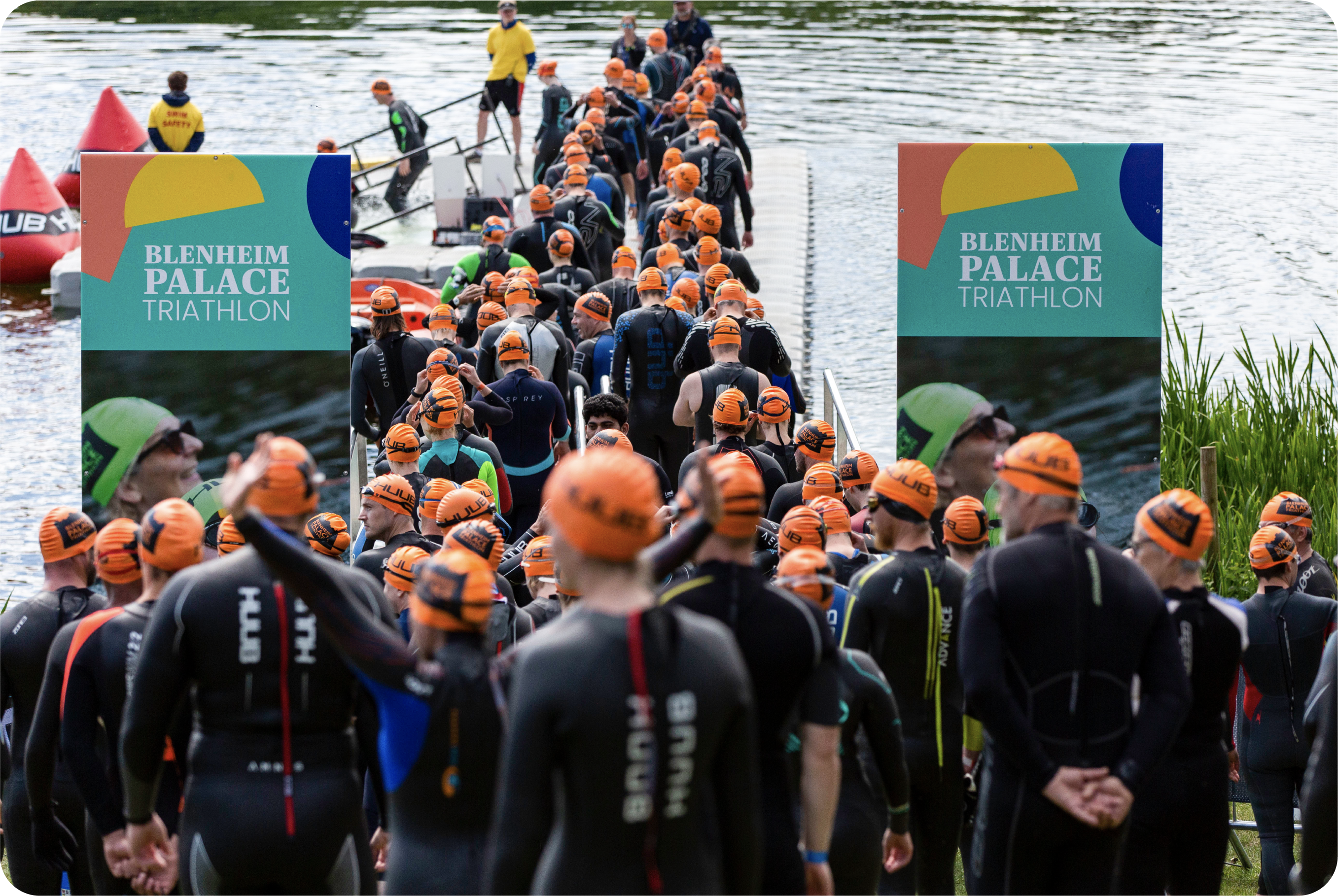
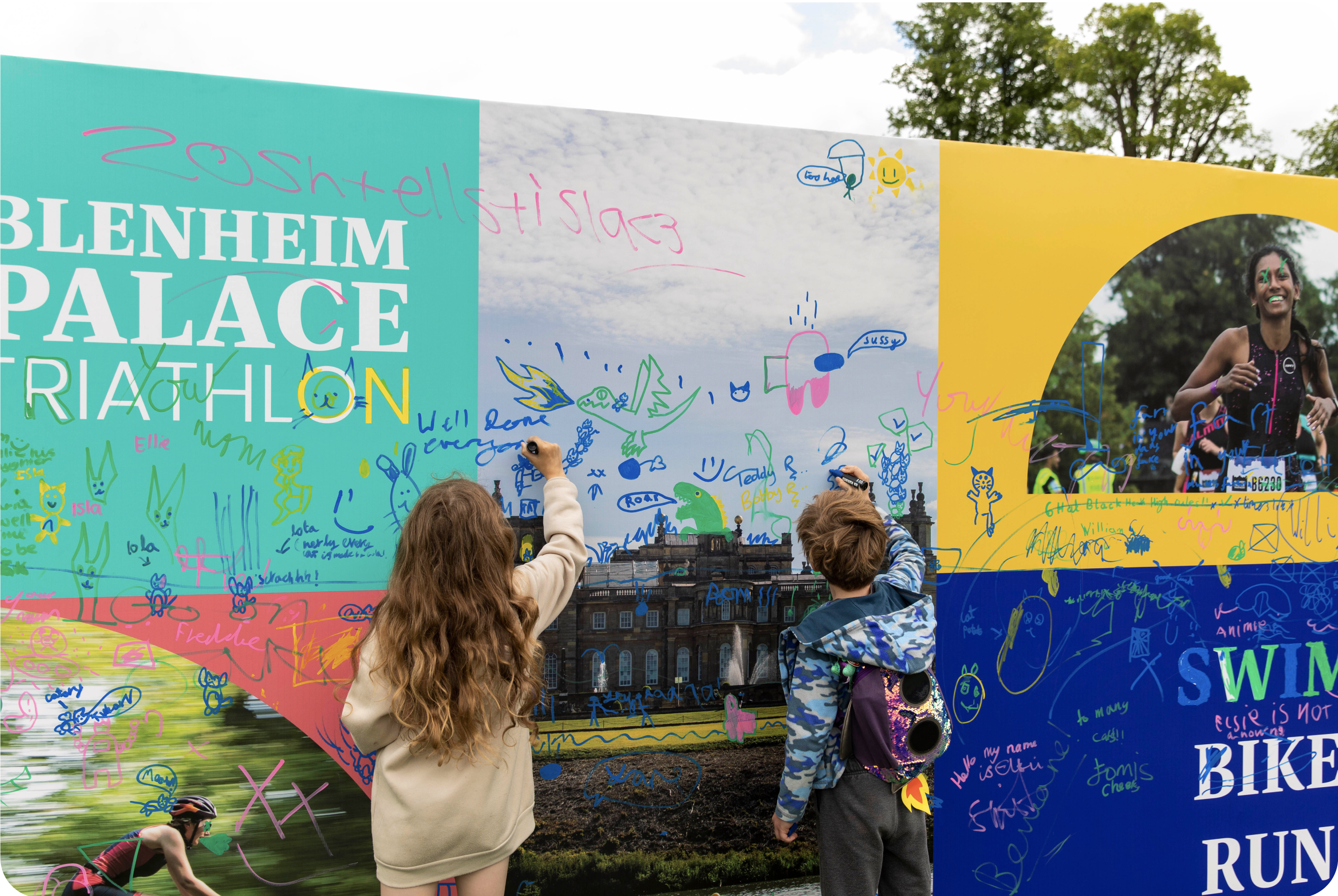
Blenheim Palace Triathlon is a sporting event like no other. It strives to challenge participants and create a fun, artistic, and cultural atmosphere for everyone. Both spectators and participants can get involved in creative activities, explore the palace grounds and eat local food.
The new visual identity has been designed to reflect the culture and heritage of Blenheim Palace. An important component of the new brand identity is the shape library. The shapes were inspired by the windows at Blenheim Palace and its iconic architecture. Each shape has been assigned to a different challenge in the event, and is used as a visual tool to speak to certain audiences depending on the challenge they have chosen. The shapes can also be used as a decorative element in conjunction with photography to bring focus to a subject.


